Making of Gameboy limited spacecraft wall tileset


(images don't seem to be working for some reason, so refer to the uploaded images in order (hopefully))
Continuing my journey of making a proper Gameboy game in GB Studio, I came across an interesting topic I wanted to cover in this devlog in hopes that someone may read it in the future and gain some insight without spending hours looking at 4 shades of green. In my Trello project for Almost Human there is a big card called Spacecraft. It is there because the game will take place on a spacecraft. And so I had to create tiles for a spacecraft with GB limitations. As a reminder of GB limitations, and more specifically GB Studio limitations, here's a quote from GB Studio official documentation:
Backgrounds are divided into8pxx8pxtilesets so the total image size must be a multiple of8pxin both width and height. A background has a minimum size of160pxx144px(the screen size) and currently a background can be no larger than256pxx256px.
An image can contain no more than 192 unique8pxx8pxtiles at once due to memory limits. This means that even using the smallest background size possible you must repeat about half of your tiles. Where possible repeat tiles between images as they will be grouped together saving on total game size.
- https://www.gbstudio.dev/docs/backgrounds/
You might think that this makes creating assets for GB Studio tedious, but actually it makes it more fun (at least for me :p). I set out to make an efficient tileset for the walls of the spaceship because they will be used in most of the scenes. I want the game to be as detailed as it can but with clean sci-fi aesthetics. From what I can gather, most RPG games on the Gameboy have their world seen from what I found out is called Dimetric view. Think Pokemon Red/Blue, or any Pokemon game before the 3D ones for that matter, hell count them in too.
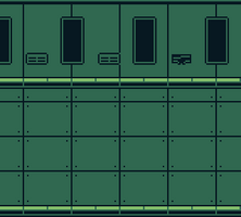
I started by trying to rework a scene that was made for the first VN* version of the game. But as you can see it looks a bit clunky:
Around 39 tiles
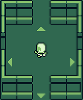
I didn't want to use any part of it for the new game, but I really liked the areas where the bright parts are so based on that I made a tileset that looks like this:
Around 24 tiles
First of all I avoided using the brightest color for this tileset. I shortened the walls because they were very high in the VN scene, I made it more simpler and cleaner, I also added the side walls and the bottom wall, which is black because it is on the outside of the ship. This probably took me around 1 hour, as I was playing around with the 3 shades, I came to this and thought it could be the perfect tileset for what I need. I felt like the walls could be shortened further, to save up some space and tiles:
Around 24 - 1 tiles
Arguably, longer walls look better but there is no time to ponder about that since making them long again would be easy if it is absolutely necessary to do so in the future. Shortening the walls liberated 2 vertical tile spaces on the map (above player's head and under the bottom wall if you can't see it). This gives me more space to place objects in the world, or to simply allow the player more freedom of movement. However that is not all, this also removed 1 tile from the tileset entirely (top wall, middle tile).
I noticed something else that could be improved, I made the bottom wall dark because, logically, things that the player character can't see are dark (right c; ?). By making those walls light color like the top walls I could liberate more tiles, so of course I did that, it didn't look bad so I kept it:
Around 39 tiles
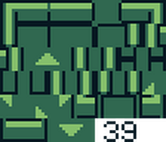
Now I had around 39 tiles total, bear in mind that I added the arrows to indicate less visible doorways on the left & right side. I had to compliment those with up & down arrows. They all used up 2 tiles each. Here's the tileset image for reference:
At this point I noticed the obvious improvement of shifting the left & right arrows 4 pixels to make them use up 1 tile instead of 2, but also something not so obvious:
Around 39 - 4 tiles
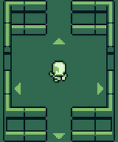
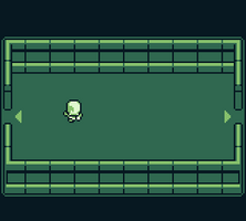
By shifting the left and right walls by 2 pixels (which doesn't affect the players movement), I got rid of 4 tiles. The scene looks unchanged. All of those minor improvements to ultimately make a tileset that would allow me to add the maximum amount of detail to my scenes. This is the latest version of the tileset used in the scene Bridge in the Hold:
IDK anymore
I had to shrink the top and bottom walls in order to add the outline to those sides. I am happy with this "final" result, it looks spacious (pun intended) enough and has a lot of tile slots free for detail to be added in.
I will try to make other devlogs detailing similar processes. Thanks for reading !
*: Visual Novel
Almost Human
A Gameboy game
| Status | In development |
| Author | P. Kostic |
| Genre | Adventure |
| Tags | Game Boy, gbstudio, Pixel Art, Retro |
| Languages | English |
| Accessibility | Color-blind friendly, Subtitles, High-contrast |
More posts
- I'm backOct 20, 2023
- Making changes to the default GB Studio fontAug 21, 2020
- Remaking the Visual Novel into an AdventureJun 09, 2020
Leave a comment
Log in with itch.io to leave a comment.